Logo
Our logo is our face to the world, and the embodiment of our design concept

There's more than meets the eye
- The idea is based on the following conditions:
- All elements are always there
- Orthographic projection and the right perspectives hide them
- Based on the angle you view the composition, different symbols emerge.


Variations
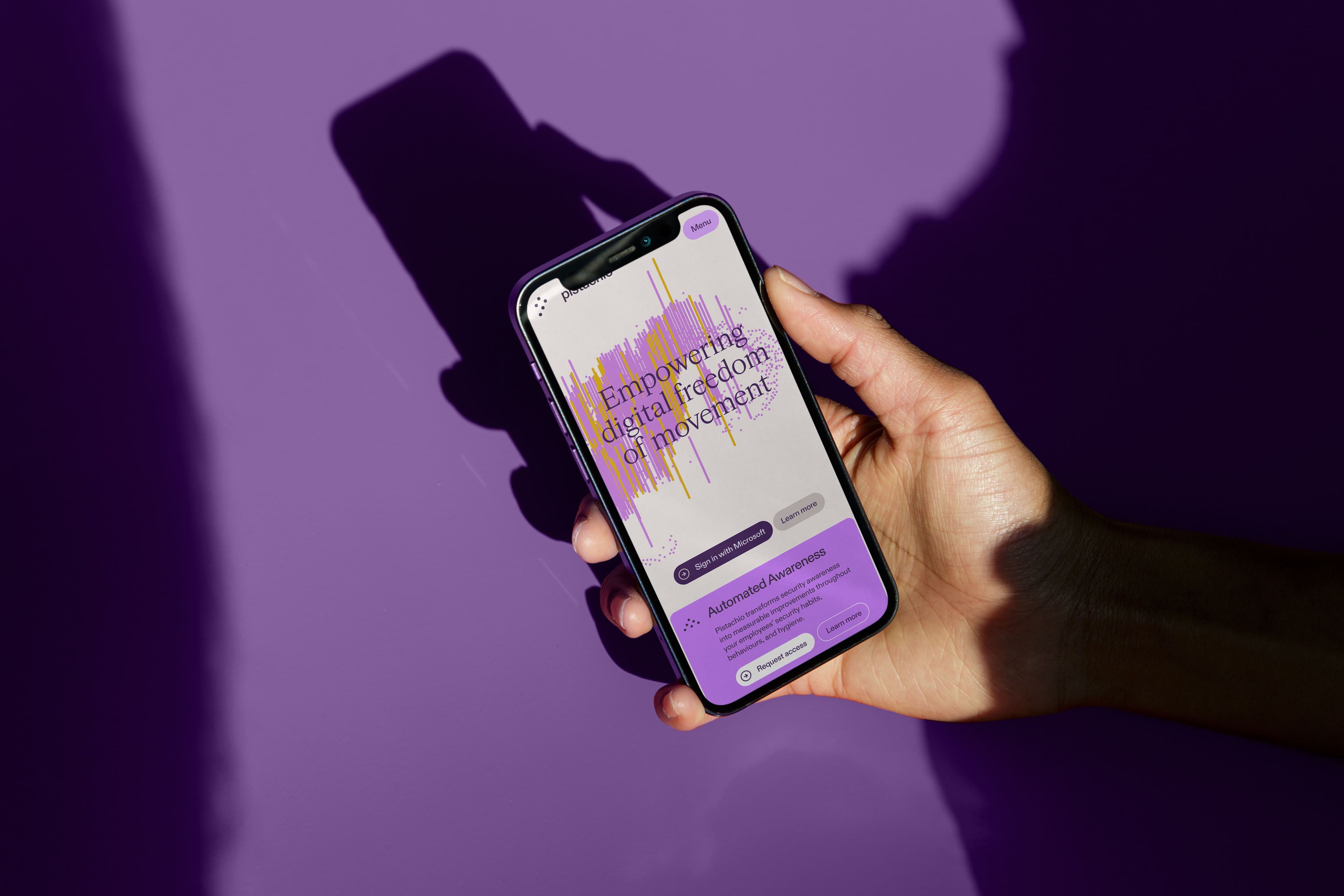
For our marketing sites and product, we try our best to implement the 3D version of the logo.
For any fixed surfaces we have 3 variants of the logo that we use.


Usage
Depending on the context, we can allow ourselves to separate the symbol from the wordmark.
Examples are
- Any Pistachio services or outlets where the brand is prominent
- Social Media where the user name clearly states the Pistachio name
- Any printed matter where the Pistachio wordmark is present elsewhere on the object
Color Variations
Our logo is available in several color variations to suit different design applications. Use the Violet or Black version of the logo as the default choice whenever possible. If the logo must appear in black and white or grayscale, use the monochrome version.
Placement on Backgrounds
When placing the logo on a colored or photographic background, use the [insert full-color or monochrome] version of the logo, whichever provides the highest contrast for legibility. Make sure the logo stands out clearly from the background.
Minimum sizes and Clearspace
- The logo should never be used smaller than [insert size] inches in width or height. This ensures that the logo remains legible and recognizable.
- Always maintain a clear space around the logo, which is at least 1x of the symbols width. This prevents any other design elements from interfering with the logo's visual impact.
Don't's
A very few simple rules for keeping the integrity of the logo intact.
- Do not alter or modify the logo in any way. This includes stretching, distorting, or changing the color of the logo. Always use the original files provided in the brand assets.
- Do not recreate the wordmark by simply typing out Pistachio. It has been specifically kerned and spaced.